
Accessibility isn't an afterthought, it's in the design.
Accessible training documentation has become an industry standard. This means ensuring that a Microsoft Word document or PDF meets WCAG 2.0 accessibility criteria in terms of its readability: visible contrast, organization, and order.
Now, if only there were a way to take any published document and push a button to make it accessible! Unfortunately, despite some really great tools that can take you most of the way, there is no magic button.
That's why at Flint, we build accessibility into our planning and processes for all the training materials we create for our clients and their learners. This is much more than making sure our eLearning modules and supporting documents can be read by assistive software tools like ZoomText or JAWS reader. Sometimes, it means looking at training materials in a different way from what you might expect.
Take infographics, for example. Infographics take detailed or complex information and metrics and summarize the key data points in small chunks laid out in conjunction with eye-catching supporting graphics. As they are easy to read at a glance, they're a great way to communicate information quickly, and are also extremely popular.
With that rise in popularity comes the need to make infographics accessible. Infographics are a special kind of document in that they are created with visual learners in mind. This means that the process to make them accessible requires planning from the top, in the design phase.
Here are some tips and considerations for designing and creating accessible infographics.
1. Designing with Accessibility in Mind
Don't create your infographic and then try to make it accessible later. This will likely lead to redesign and redevelopment. Design the infographic with accessibility in mind from the beginning.
2. Text-Based Communication of Key Information
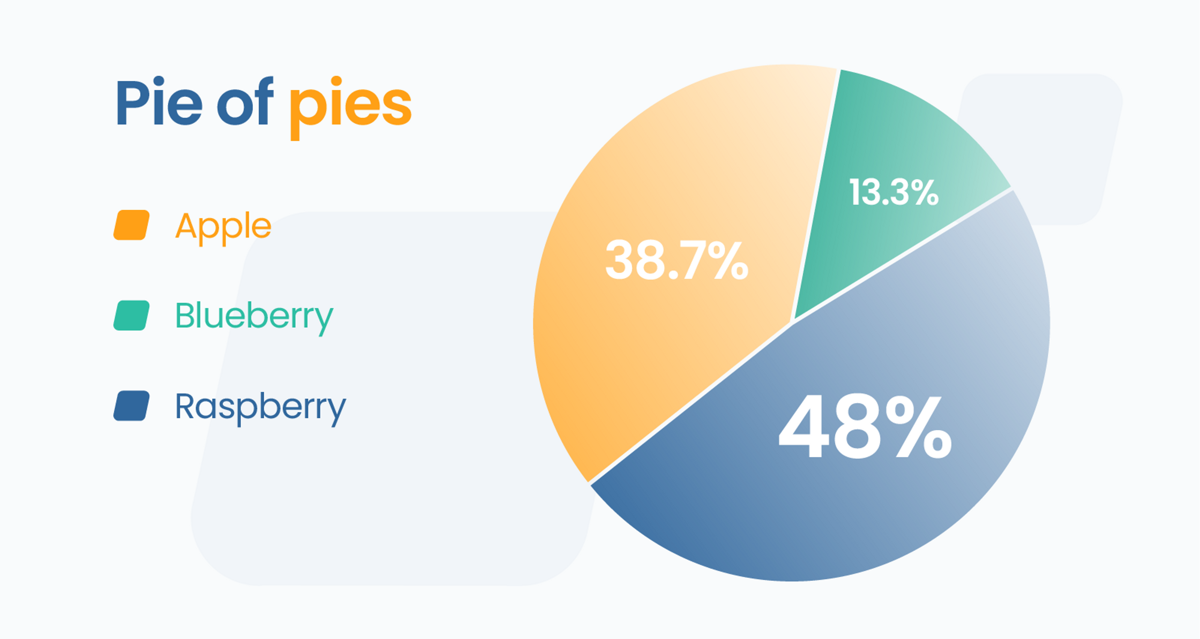
Communicate key information in text form rather than in graphic form. Though this might sound counterintuitive to the goal of an infographic, it's essential to ensure that all learners receive the same important information. The graphics support the text, not the other way around. A pie chart is a good example: while it's visually useful to see the different sizes of the pie slices, the percentages are the key information. The pie chart visually supports the data.
3. Accessibility in Design Elements
In the design, ensure colour contrast, font sizes, text and graphic layouts, and object layering will meet accessibility guidelines. If your infographic is created using a tool such as Adobe InDesign or Illustrator, try to avoid a lot of layering of text over graphics. When text intermingles with graphics --- especially coloured graphics --- there is a risk of issues arising due to lack of contrast.
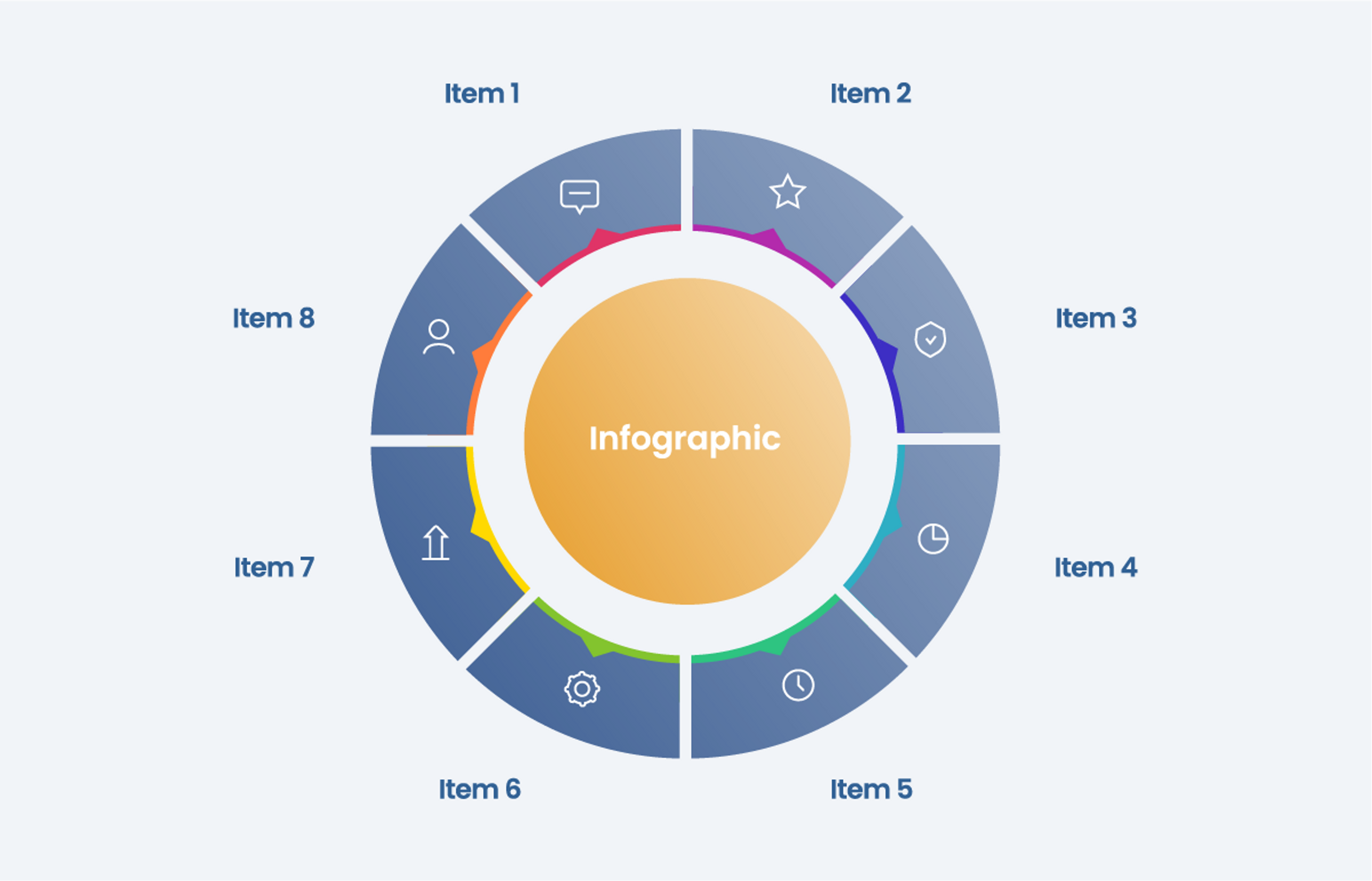
4. Considerations for Non-linear Content
Infographics are unique because the content rarely conforms to the typical linear left-to-right, top-to-bottom format. Take a wheel- or cycle-style infographic. An assistive tool might not know in what order to read the text captions. Ideally, try to design for left-to-right, top-to-bottom reading. However, if that's not possible, use a tool such as Adobe Acrobat to manually set the reading order of text that doesn't appear in a linear order.
5. Publishing Accessible Infographics
Publish infographics as PDFs and use an application such as Adobe Acrobat to apply accessibility formatting. Here, you can apply alt text (image descriptions) to images if necessary, keeping descriptions concise. You can also ensure the reading order of headings and body text is properly applied.
6. Testing for Accessibility
Once you've formatted the infographic for accessibility, test your document using assistive devices such as ZoomText and JAWS. Even though you've anticipated the learner experience and designed the infographic to be accessible, testing ensures that the bugs are worked out before the document is finally published and delivered to the learners.
Just like any project we undertake at Flint, planning and design before developing and publishing infographic documents is the smoothest way to meet accessibility standards, ensuring a positive learning experience for all users. Contact us if you need assistance in creating accessible graphics for your next learning project. We look forward to discussing it with you!